Is It Fake News? How To Evaluate News Sites You’re Reading
Headlines were rife with the words “fake news” beginning around the time of the election for the 45th president. According to Google trends, it reached its peak as a search term in January 2018, when the president “awarded” a number of news outlets he disagreed with what he dubbed Fake New Awards in a blog post on the Republican Party website. Though his beef with fake news was detrimental to understanding the realities of news and the purpose of journalism, the former president’s ire was a dogwhistle to many who saw this as an opportunity to develop their own news platforms and sell their perspectives as The Truth.
Combatting fake news is hard enough, as is determining a website’s perspective, their tone, and their reputation. Numerous charts have floated around social media, including this excellent chart on media bias developed by Ad Fontes Media, a public benefit corporation whose goal is to use rigorous methodology to keep consumers informed about the news they’re consuming.
There’s been a further wrench thrown into understanding media bias and fake news in more recent times. Certainly, this isn’t the first instance of this tactic, but because of how prolific it is, it’s essential to understand: right-wing operatives have created numerous fake local news sites that look, feel, and read like actual local news but are little more than tools for manufacturing outrage and misinformation. As local news has disappeared over the last two decades — one out of four local newsrooms have shuttered since 2004 — the space for those with the financial means or access to financial means (aka: dark money) is wide open. These tactics are terrifying in what they lead readers into believing and therefore, acting upon. The headlines and stories are crafted for social media outrage.
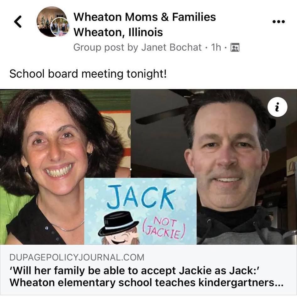
The above image was posted to an Illinois parent Facebook group, showcasing a story about a book being read to Kindergarteners in Wheaton elementary schools. The headline says it “teaches kindergarteners about cross-dressing.” But when you read the story, you discover pretty quickly that it’s not being taught in kindergarten classrooms. Rather, the book is available in libraries in the district. More information in the article goes on to describe the book being published in partnership with GLAAD and Bonnier Publishing, then the following paragraph is an aside about another book about queer identity for young readers that isn’t at all related to anything in the prior paragraphs.
At the end, we learn the salary of the principal at the school where Jack (Not Jackie) is in the library.
The headline, paired with some buzzwords, is enough to create outrage on social media and become a rallying cry for those aligning themselves with censorship, as well as with right-wing groups working to take down school and library boards across the country. There’s no actual information in the article and no story. It’s a mishmash of words without anything unifying them and yet, because of how the story is presented — the site looks professional enough and certainly more “real” than, say, Patch.com, which is a legitimate enough source for local stories.
DuPage Policy Journal is not a real news source. It is a product of Dan Proft, a former GOP candidate for Illinois governor, conservative talkshow host, and founder of Local Government Information Services, which has over 1,300 sites across the US. His partner is Brian Timpone, a conservative businessman. These sites are hyper-local, aiming to fill the voids left by the death of local news. But instead of providing news, these news sites provide misinformation that, according to their own purpose statements, “We believe that local government works best when voters have ready access to public data about the use of their tax dollars: how much money is being spent; where it is being spent; how it is being spent.”
Likewise, they are open about the fact “We believe in limited government, in the constructive role of the free market and in the rights of citizens to choose the size and scope of their government and the role it should play in their society.” Funding is provided by “advocacy groups” who “share their beliefs.”
Proft and Timpone aren’t the only right-wing operative doing this. It’s proving to be a goldmine for conservative insiders.
Journalist Judd Legum laid out the massive misinformation campaign about “critical race theory” in a series of tweets further exposing the network of so-called local news sites. The entire thread is essential reading, but the two notes below are especially concerning, as they give credit to a site on this fake news network for helping Republican Glenn Younkin win the gubernatorial election in Virginia (he, as you may recall, put “critical race theory” and book censorship at the top of his campaigning priorities).
While those who are active in right-wing political circles know about these sources and many use them to their advantage, either to push forward their agendas or to “cite their sources,” the reality is that too many unsuspecting individuals are sucked into these stories believing them to be real.
The average person reading what looks like a typical news website would have no idea what the purpose or seedy truth is behind what they’re reading. This is absolutely an issue of media literacy, worsened by a lack of information literacy and the growth of actual fake news and misinformation over the last half-decade. The death of non-partisan local news which works to serve its community and be the government watchdog, political watchdog groups now can step in and play this role, without ever having to make clear they’re working on an agenda — their agenda.
So what can you do? How do you know what you’re reading is reputable and not part of this chain of fake news sites and how do you debunk the fake news your friends and family are posting on social media? Here’s a guide to identifying bias and misinformation in news, as best as is possible.
We’ll use the DuPage Policy Journal as an example.
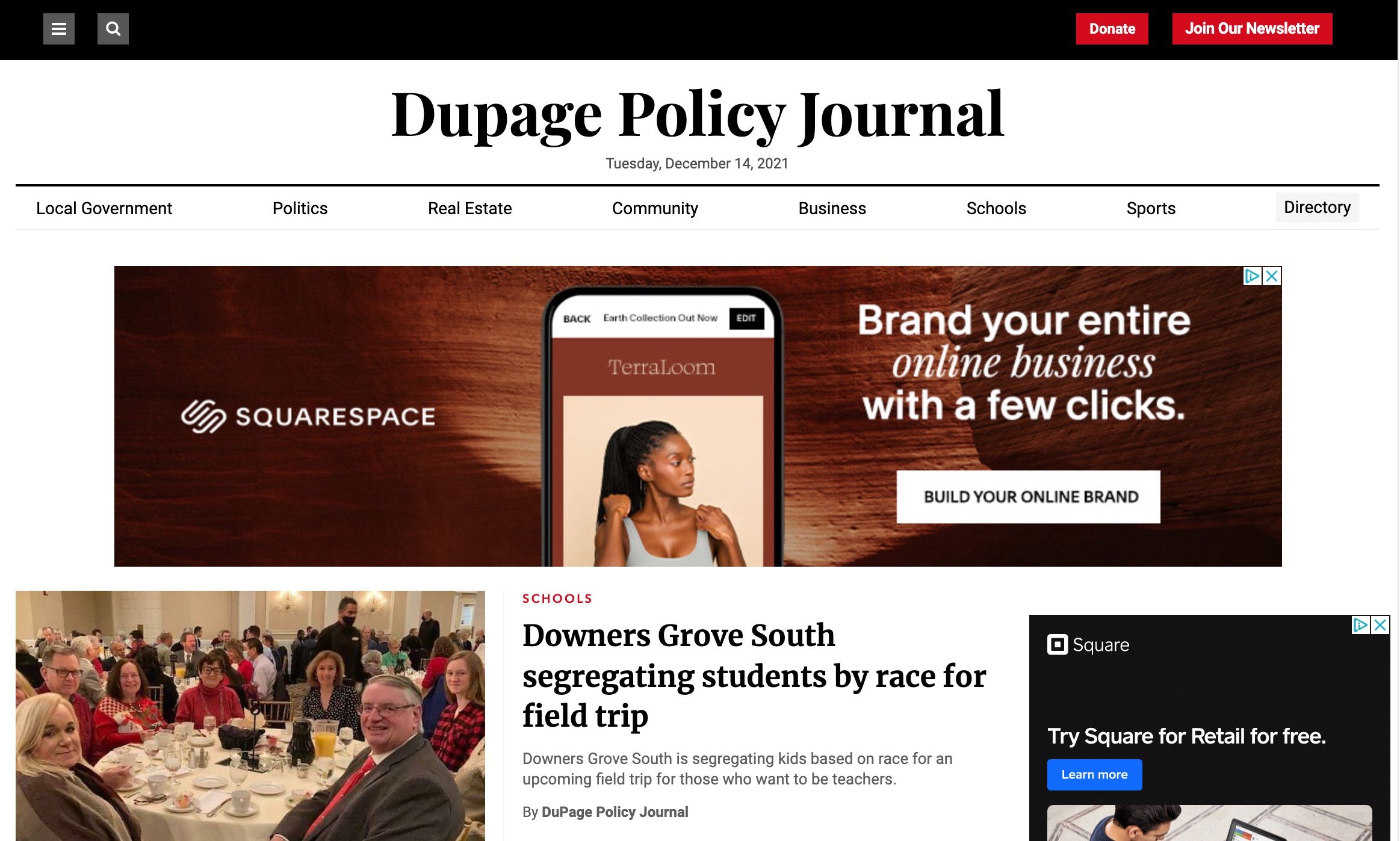
A quick glance makes this look pretty reputable. It’s got a layout we’ve seen on many news websites, including targeted advertising (i.e., what the robots think you’d be interested based on your own internet habits). The verticals within the paper don’t necessarily toss up red flags, either, as it’s clear from the name of the paper the interest is in policy. There might not be a news category.
But then the first headline and first story should give you pause: what does that photo have to do with a headline about race segregation on a high school field trip? It’s mostly older white people sitting at a banquet table, without masks, with a handful of younger people there as well.
The big red flag, though, is the byline: “DuPage Policy Journal.” Why isn’t there any attribution given for what appears to be a news story?
When we click the “local government” category, we’ll discover the story of the photo.
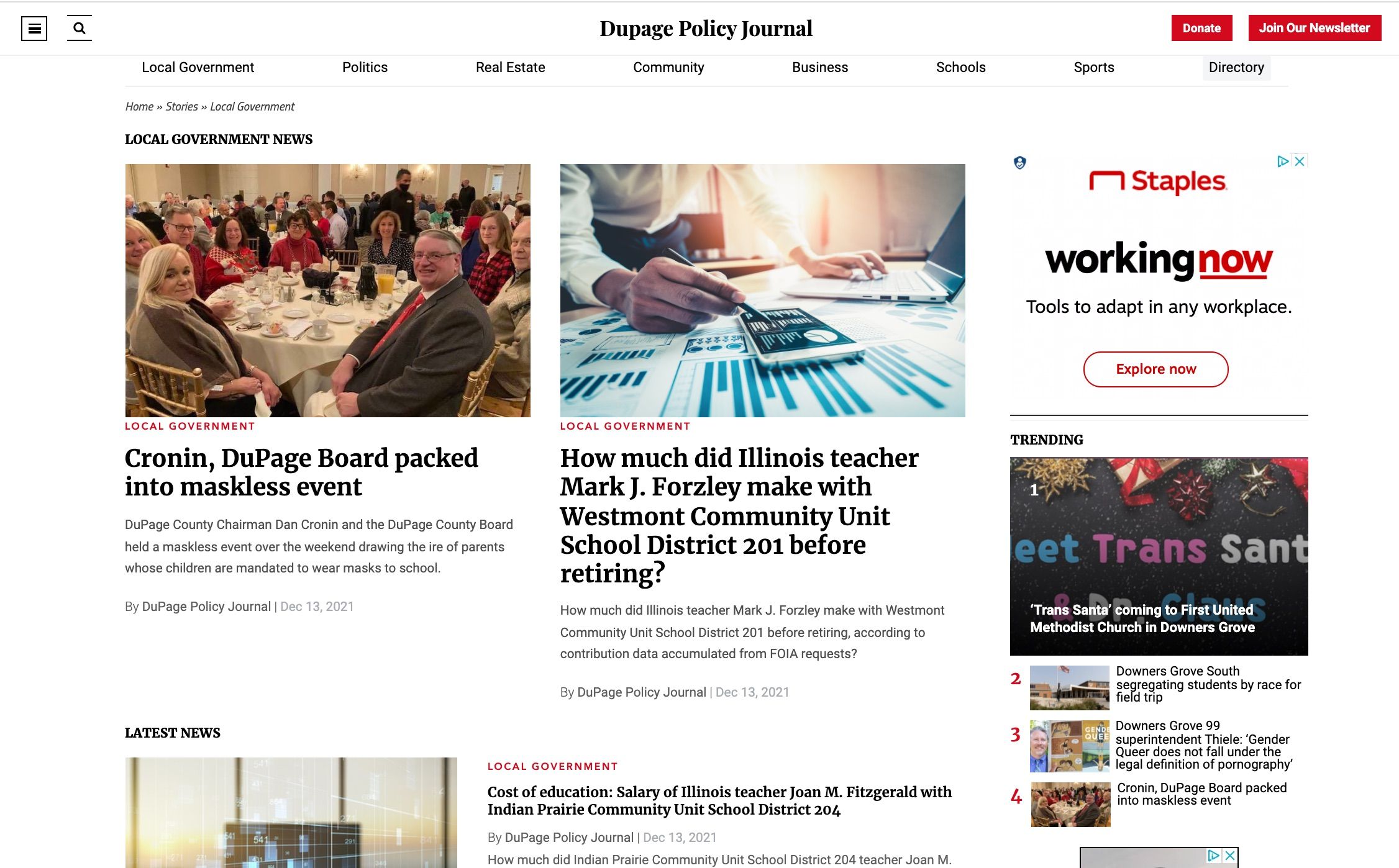
Turns out the photo was a means of writing a story about how students shouldn’t need to wear masks in school all day, one of the current political hot-button issues in Illinois. While Cronin is a Republican, the story also allows the opportunity for endorsement of a Republican running to replace Cronin in the fall 2022 election. Then, there’s this:
A Center for Infectious Disease Research and Policy commentary found that “cloth masks and face coverings are likely to have limited impact on lowering COVID-19 transmission, because they have minimal ability to prevent the emission of small particles … and offer limited personal protection with respect to small particle inhalation.
The Center for Infectious Disease Research and Policy is a real organization, based at the University of Minnesota. The commentary, though, was requested to be redacted from the website, based on limited understanding at the time the commentary was written and the fact it was being cited by anti-mask groups as evidence masks don’t work. The story was written in April 2020, when it was true we did not have enough information about masks. And, in fact, the commentary — note “commentary” here and not news or new research findings — states this, too:
Despite the current limited scientific data detailing their effectiveness, we support the wearing of face coverings by the public when mandated and when in close contact with people whose infection status they don’t know. However, we also encourage everyone to continue to limit their time spent indoors near potentially infectious people and to not count on or expect a cloth mask or face covering to protect them or the people around them. The pandemic is not over and will not likely be over for some time. As states and local jurisdictions reopen, we encourage people to continue to assess and limit their risks. Cloth masks and face coverings likely do not offer the same degree of protection as physical distancing, isolation, or limiting personal contact time.
Fake news works to build outrage because it cherry picks what to include and what to conveniently leave off.
But the biggest red flag for a reader looking at this news site should be the simplest one: why are all of the pieces given a byline of the paper? Are there no individuals writing for it? Since when does an entire paper’s voice and storytelling come to one identity?
The answer is it doesn’t.
From here, any reader should navigate to the “About” page, often shoved at the bottom of the website and made as inaccessible as possible. For The Dupage Policy Journal, it lays out in clear language this isn’t an objective, fact-based news source.
You have to be able to get there, first, as the site implements an infinite scroll, making the footer challenging to get to unless you do so quickly.
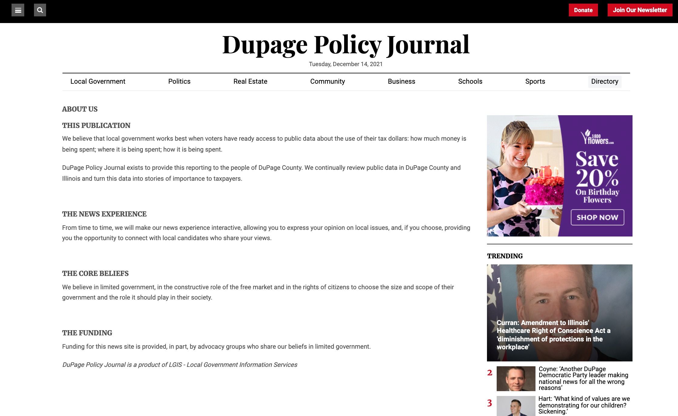
All of the information here is what was cited above, and for readers, the language here is full of partisan rhetoric: “limited government,” “role of the free market,” and “important to taxpayers.”
Want more? You’ll see that the DuPage Policy Journal is part of the LGIS, and if you click over to their website, even more partisan rhetoric peppers their statements.
Finally, the last red flag here is that no where on the Journal’s website is there a masthead, or the place where you can learn about those who are putting the paper together. The “contact” page features only two emails, one for news and one for press releases — both of which are that work followed by the journal’s name.
Any reputable news site has a masthead so you know who is behind the creation of it.
So now that it’s clear what a fake news site looks like, how about a look at another paper for DuPage County? First: it’s worth noting this is a bureau of a larger chain of more local Chicagoland newspapers, The Herald. But because this is focused on DuPage County, it’s a great example of what to look for for authenticity (and remember, authenticity doesn’t mean you have to agree with opinions in the op-ed section — but it means the facts were checked).
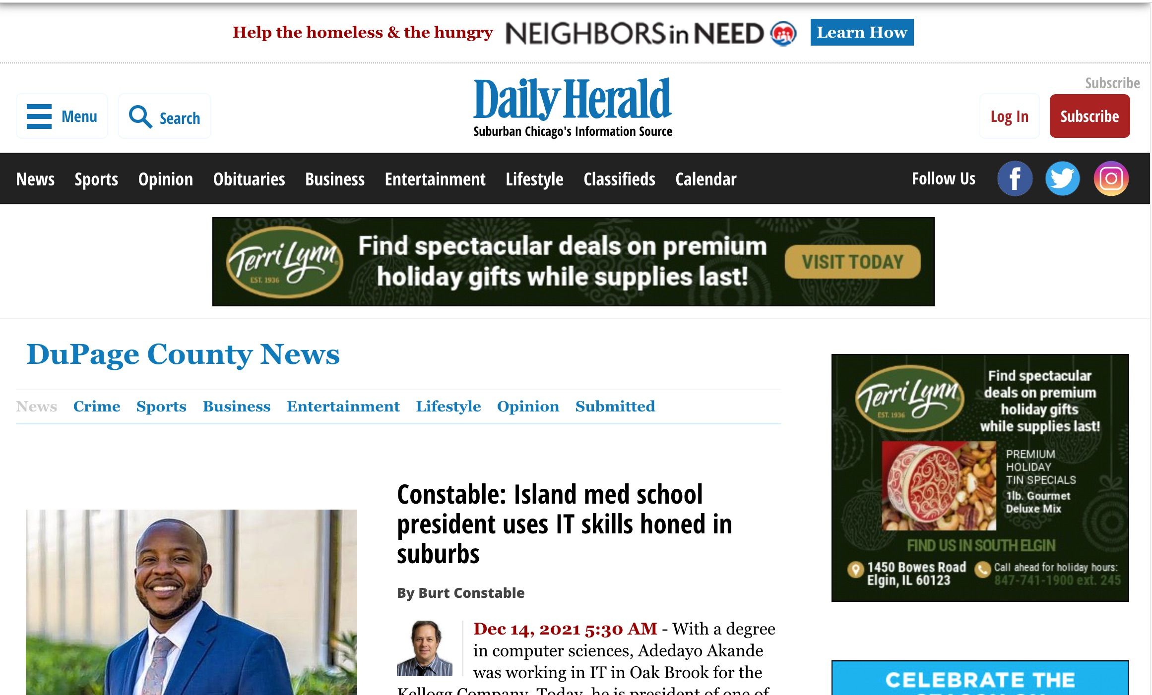
It’s amazing how similar the landing page is, but the differences are quite obvious: the photo for the top story corresponds with the top story, which has a byline (and bonus photo of the writer), along with a time stamp and date for when it was published.
Though there’s no “local government” section to compare apples to apples, let’s continue to scroll the news section.
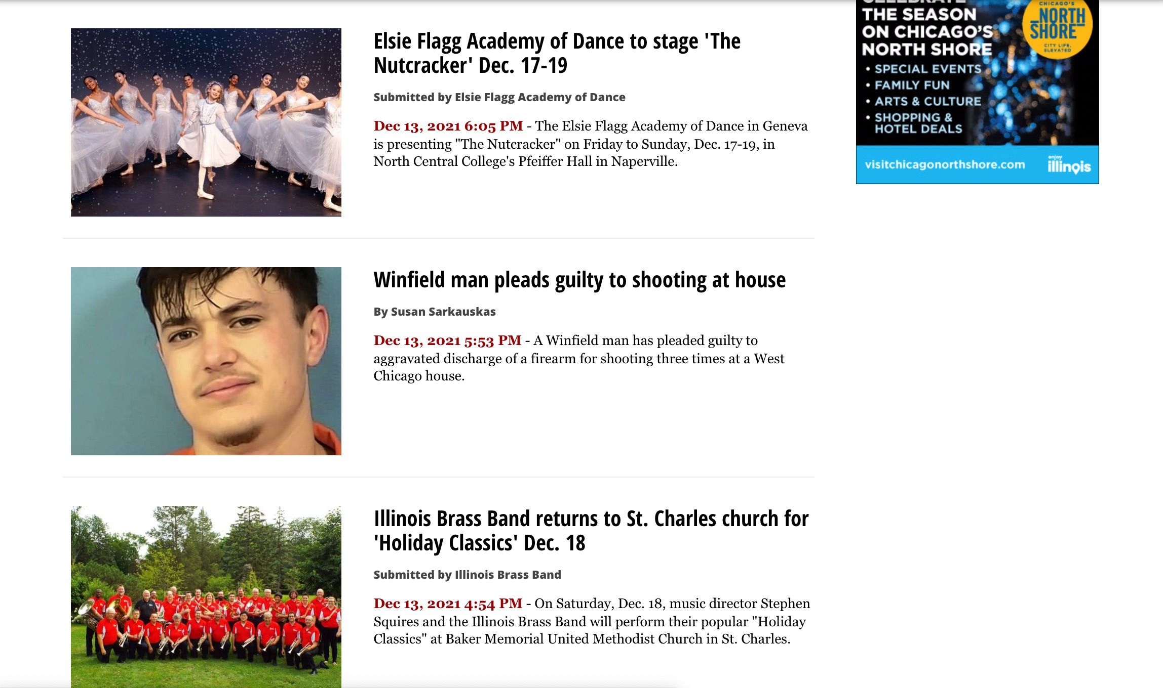
This is a little tricky, but this is an excellent example of using information and media literacy to navigate. It looks like there are three major stories here, and while there are three stories, only one is from the newspaper — the center story, with a byline. The other two, about the Nutcracker performance and the Brass Band performance, are not by anyone on staff at the Herald. They are instead press releases, indicated by the way they’re bylined: “Submitted by _______.” Readers know the exact provenance of the stories, key to distinguishing news from publicity.
The Herald does not have an infinite scroll on their news, meaning that navigating to the bottom and their “about” section isn’t hindered.
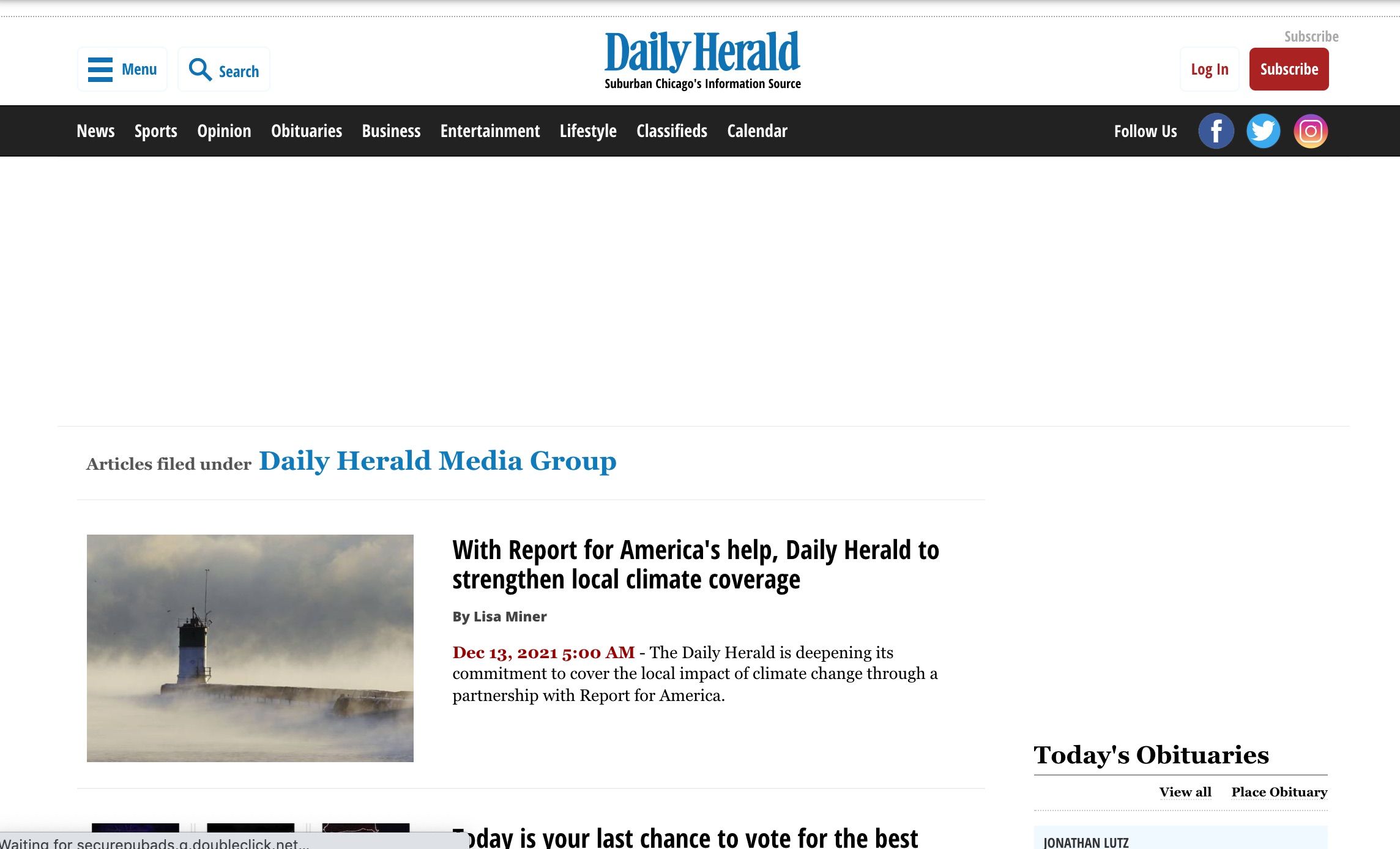
The “about” page is a collection of articles about what the Herald is doing in their journalism. The top article is about a collaboration between the Herald and Report for America about strengthening local climate coverage. This is their space for transparency about the newspaper, its mission, and its goals and commitment to them.
When you scroll to the bottom of any page of the Herald, you see their ownership: Paddock Publications. If you head to that page, you’re given a wealth of information about who they are — without the political rhetoric — and all of the information you might want about the who behind it.
And when you click on the name of any author of an article on the Herald, you’re taken to their bio with all of their information. There is a masthead for all of the staff at the paper, though at the time of this writing, it’s unavailable. No worries, though: they link to all of the contact information you could want.
Information and media literacy are not easy skills to learn or master, but in a world where fake news and misinformation is abundant — and abundantly sneaky in how it’s presented — understanding how to navigate news websites is a crucial skill. The above is, of course, but a single set of tactics, but they should offer insight to help you better read, interpret, and appreciate your news sources.

إرسال تعليق
0 تعليقات