The Best Book Covers of 2021
What are the best book covers of 2021?
Many have called book blobs the trend in book cover design. And it’s true — we’ve certainly seen a lot of the so-called blobs popping up on book covers across categories. A lot of the analysis is interesting, but it overlooks one of the reasons we’re seeing this and will continue to see this: these covers pop when at the thumbnail size and they pop in images on social media. Given the challenge of getting a book to stand out anymore, the chance to shine on a screen makes a difference.
Some of the best book covers of 2021 will look like the book blob. But many will look much different. This array of book covers stand out among the crowd this year for any number of reasons, as the below explanations will enumerate.
What goes into determining a good book cover is both subjective and objective. It’s subjective in that it’s going to appeal to some readers more than others, especially if those readers have a proclivity for certain aesthetics: illustrated vs photographic, single images vs montages, stark covers vs busy covers, covers which are font driven vs those which aren’t. It’s also objective: good art is good art, and for books particularly, good art makes a book come off the shelf. It sells the story, and objectively good art both stands out and fits in. Readers who like a certain type of story can use cover art to find their next read, as much as those covers can help elucidate a book’s genre, tone, and mood.
All of the covers below include credit to the design team, as best as finding that information is possible. This is the annual reminder that information should be easily available on author websites, publisher websites, and other ready sources for readers.
The Best Book Covers of 2021
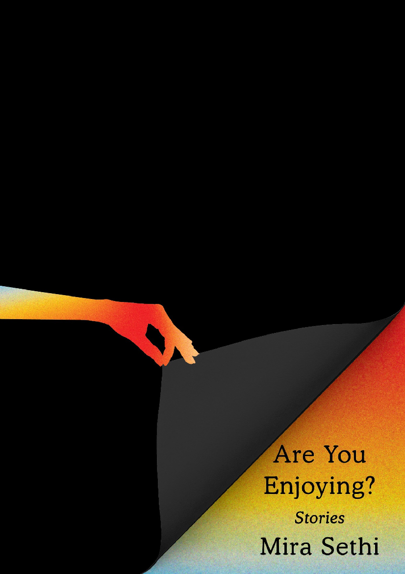
Are You Enjoying?: Stories by Mira Sethi; Cover Design by Janet Hansen
This is a bold cover choice in an era of the book blob and bright colors. Though we get those bright, rainbow hues, they stand out precisely because the bulk of the cover is black. The peeling back of the black for the title and author is such a clever (and maybe even seductive) invitation to the reader to step inside.
—Kelly Jensen

Cool for the Summer by Dahlia Adler; Cover Design by Kerri Resnick; Cover Art by Claire Allison
Cool for the Summer is about a teenage girl who finally starts dating the boy she’s had a crush on for years and who can’t stop thinking about a romantic interaction she had with a girl over the summer. The sunglasses featuring both her male and female crushes were a really nice touch to help show the central internal drama. Between this detail and the tagline on the cover, you know exactly what this book is going to be about. I also loved that her short blond hair was on the cover, because getting that haircut was an important moment in the story.
—Alison Doherty
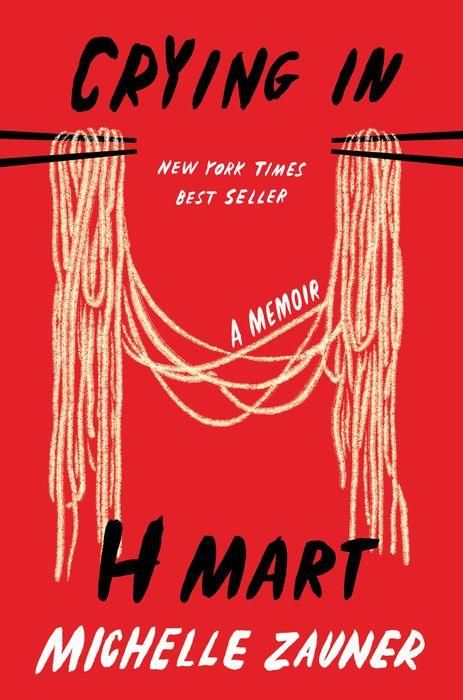
Crying in H Mart by Michelle Zauner; Cover Art by Na Kim
There are two things that make this cover stick to the inside of my brain. The first is its simplicity: the bright red, punk font, and giant noodles stand out perfectly. The second is the dual use of the noodles, which also create a giant “H”. It reminds me of the neck and green ribbons on the cover of Her Body and Other Parties, where you don’t necessarily catch what it is at first, but once you see it, you can’t unsee it. Brilliant!
—Susie Dumond

Death in Bloom by Jess Dylan; Cover Design by Danielle Christopher; Cover Illustration by Alan Ayers
This has got to be the prettiest cozy mystery cover I have ever seen. It’s so warm and bright and immersed me in the setting — a flower shop in Tennessee — before I even opened the book. Plus, look at the little corgi! Look at his stubby legs! He just looks so happy to be there, and I’m happy he’s there, too. Plus the pun in the tagline is top tier: “Finding out whodunit, once and floral.”
—CJ Connor
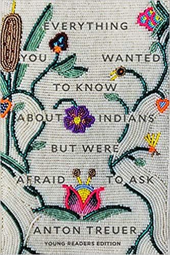
Everything You Wanted To Know About Indians But Were Afraid To Ask (Young Reader Edition) by Anthony Treuer; Cover Art by Jana Schmieding (Lakota); Cover Design by Rodrio Corral Studio
The intricate beadwork on this cover is incredible and perfectly reflective of the thoughtfulness with which Treuer approaches a wide array of topics about Native and Indigenous people. More impressive is that this was traditional hand beading done specifically for the book. A Native written book with a Native created cover is noteworthy in and of itself. Take a moment and really study the layers and details here — it’s impressive, and for a Young Reader’s Edition of an adult book, which often takes its rendering from the original edition, it’s awesome to see such thought into making this a wholly distinctive book.
—Kelly Jensen
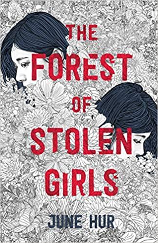
The Forest of Stolen Girls by June Hur; Cover Illustration by Pedro Tapa
You only need take one glance at this cover to understand why it’s my favorite of the year. I mean, just look at this work of art, this absolute masterpiece. I want it framed. I want it on my wall. I want it everywhere. The black and white field of flowers in the background, only broken up by the partially obscured faces of the two sisters at the heart of the story and the bright pop of red text, makes this cover so eye-catching and memorable. It represents the book and its themes so perfectly, too. Find me a prettier cover. I’ll wait.
—Rachel Brittain

I Love You But I’ve Chosen Darkness by Claire Vaye Watkins; Cover Design by Rachel Willey
It’s the combination of art styles that drew me to this cover, and the combination that keeps bringing me back to it: the mix of illustration style with a stark sans serif title and some scrawling handwriting. It fits so perfectly with the novel itself, feeling like a well-put-together chaotic jumble that is beautiful and messy and a bit intimidating.
—Cassie Gutman
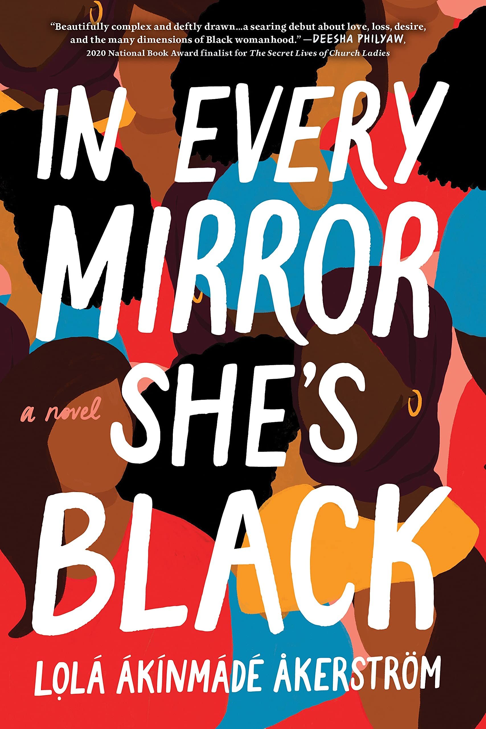
In Every Mirror She’s Black by Lola Akinmade Åkerström; Art Direction by Heather VenHuizen; Illustration, Hand Lettering, and Design by Kimberly Glyder
When I first saw this cover, I didn’t know what to expect! I wasn’t sure if it was going to be horror, suspense or what. However, after reading it, I now understand the cover more and I find it quite brilliant.
—Erika Hardison

Lakesedge by Lyndall Clipstone; Cover Design and Art by Rich Deas
No one brings the drama like Gothic authors and their cover artists. For decades, the Gothic cover trend was best described as “women running from houses.” Check out the blog by that name if you love those covers as much as I do. With Lakesedge, the trope is flipped. The young woman in her diaphanous bed jacket is inside the manor, approaching the lush candlelight and the mysteriously backlit man/monster at the top of the stairs. She’s boldly going toward the danger, and as a reader, I’m right there behind her.
—Isabelle Popp
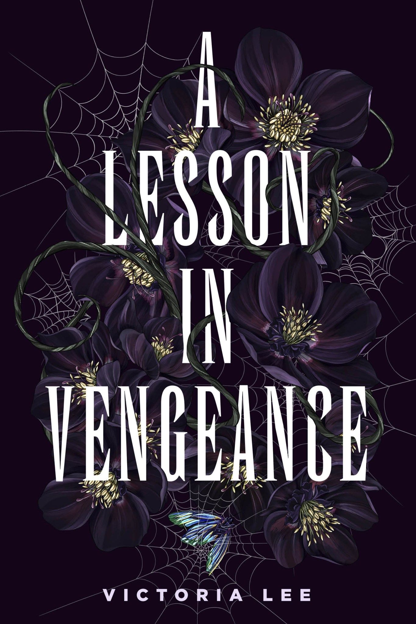
A Lesson in Vengeance by Victoria Lee; Cover Art by Maggie Enterrios; Design by Regina Flat
The cover is dark with intricate spider webbing and what looks to be deep purple flowers. The jacket feels soft like felt and it’s smooth to the touch. I feel like the cover can give me some magic. The vampy and alluring cover drew me more into the book as I read it.
—Erika Hardison
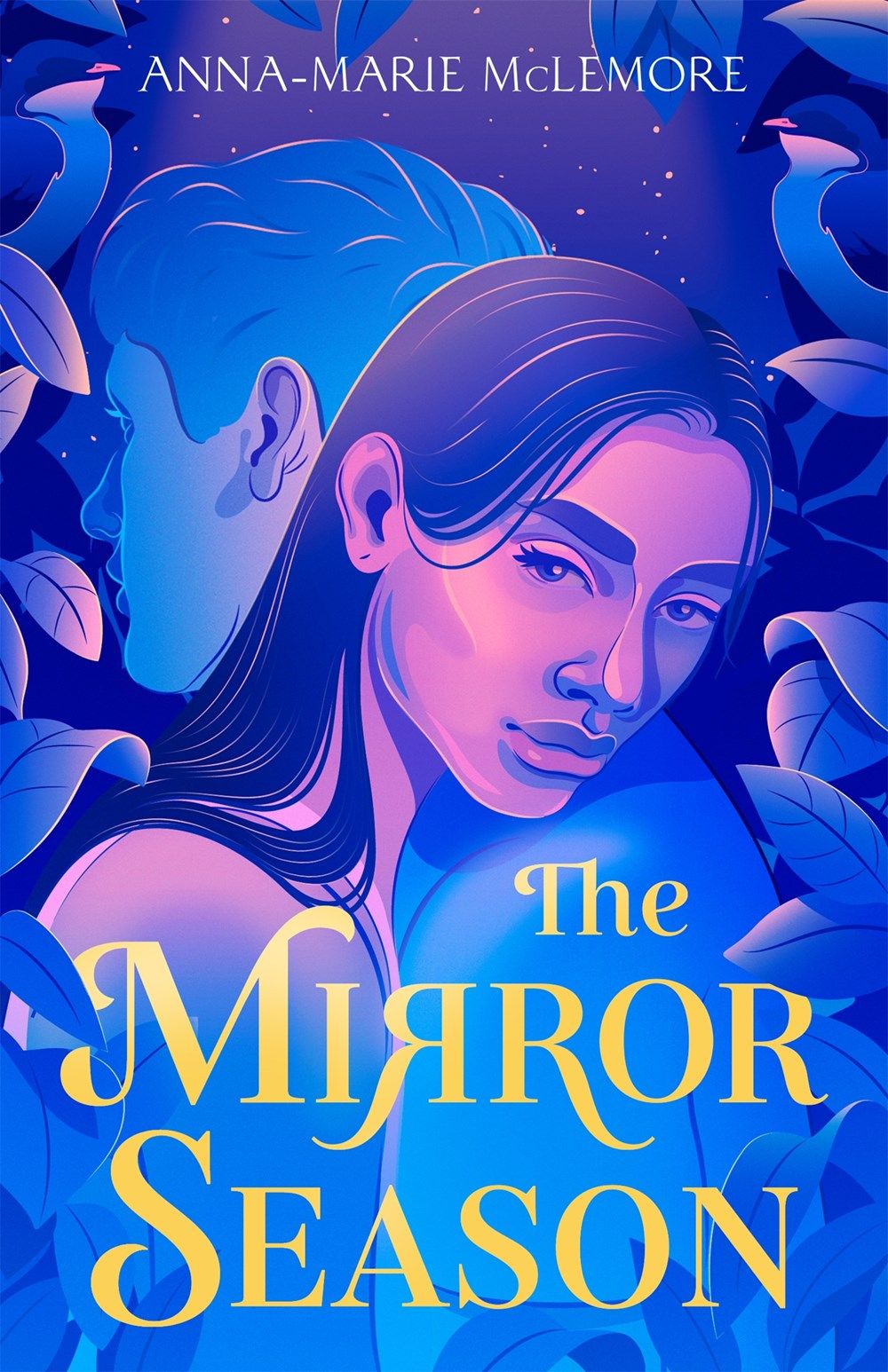
The Mirror Season by Anna-Marie McLemore; Art by Marly Gallardo; Art Direction by Liz Dresner
McLemore’s incredible novel about trauma, recovery, and strength has fantastic pansexual representation twisted through the pages full of rosehip tattoos, glass shards, and melting sugar. The queer surrealism of this book really called to me, and something about this cover captures perfectly the dreamy magical realism of the text — from the blending bisexual flag–like pinks and blues, to Ciela’s intense eye contact with the reader, to the two birds hidden among the leaves, and the dotted stars on the horizon.
—Leah Rachel von Essen

Nightbitch by Rachel Yoder; Cover Photograph by Nathan Biehl; Cover Design by Emily Mahon
I mean, just look at this cover! It’s absolutely bonkers! I saw that cover and was like, “What on EARTH could this book be about? Who cares, I have to read it.” Turns out it’s about a mother of a toddler who finds herself slowly turning into a dog. This is exactly the kind of cover a bizarre book like Nightbitch needs, and I’m obsessed.
—Susie Dumond
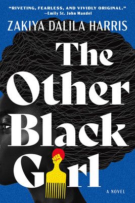
The Other Black Girl by Zakiya Dalila Harris; Cover Design by James Iacobelli; Cover Illustration by Temi Coker
The drama of this illustration and font perfectly represent what you will find inside this twisty workplace thriller about racial politics inside a mostly white publishing house. It’s fitting for most of the cover to be taken up by a woman’s afro, because Black hair choices play a huge role in the plot for Nella and the other characters in the book. The hair pick earring making up the “i” in Girl and the fact that the face wraps around to the edge of the spine are icing on this cover’s metaphorical cake. This is a truly stunning cover!
—Alison Doherty

Paradise by Lizzie Johnson; Cover Design by Elena Giavaldi
It’s easy to overlook a powerful nonfiction book cover, but in the case of Paradise, it’s impossible not to pause and feel something in your chest. The juxtaposition of the title, which we know is the name of the town destroyed by wildfire, with the blaze orange color is enough to grab your attention. But more than that, the fact the smoke is so large in comparison to the homes is a brilliant use of space to pack a punch. Readers immediately know what to expect in picking this up.
—Kelly Jensen

She Who Became the Sun by Shelley Parker-Chan (UK Edition); Cover Design by Mel Four
Publisher and seller websites don’t do this one justice. Bold red with a golden dragon weaving down through the letters is a color palette that I adore to begin with. Bookstagrammers have been sharing photos of it in real life, and wow. That gold dragon is metallic and the design across the edge of the pages is, too. I’ve never been so tempted to pay that shipping charge from the UK.
—Chris M. Arnone

Six Crimson Cranes by Elizabeth Lim; Cover Art by Tran Nguyen
I find this cover just gorgeous. I love the bold colors and the blend of photorealistic and illustrated portraits of Shiori and the cranes. I’m also a fan of how Shiori’s face is facing forward, close up, and centered. Too often I see books with cover art that features characters facing away from the picture, and I just love how this book cover isn’t like that. This story is a retelling of one of my favorite fairytales, and it also blends in East Asian mythology for a truly magical journey. When Princess Shiori’s brothers are cursed into the forms of six cranes, Shiori will do whatever it takes to break the curse and save her brothers. As someone who has three brothers, I’m a huge fan of brother-sister dynamics in stories too.
—Megan Mabee

The Taking of Jake Livingston by Ryan Douglass; Cover Art by Corey Brickley; Cover Design by Jessica Jenkins
This cover is so unsettling, but in a good way. The ghostly hands floating around Jake, who looks terrified beyond words, help to set the mood for the novel. He has that look of every single character in a horror movie who knows the creature is behind them and is hoping that as long as they don’t look directly at the creature, it won’t get them. The ghostly hands could also be reaching past Jake to get to you if you stare at it long enough. I love it all.
—PN Hinton
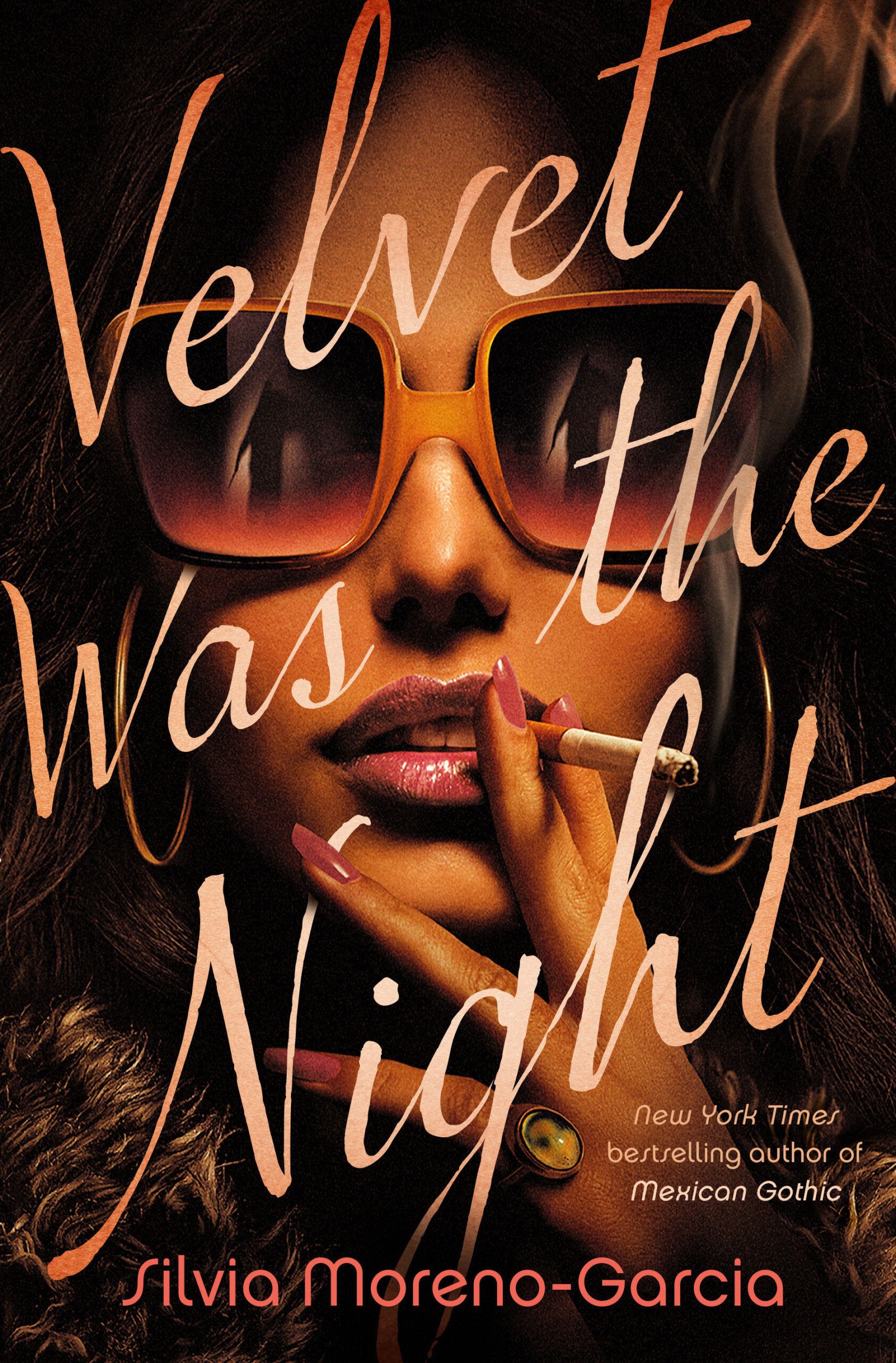
Velvet Was the Night by Silvia Moreno-Garcia; Designed by Tim Green at Faceout Studio
When you see a book cover like this across a bookstore, you can’t help but wonder what’s inside. It’s instantly iconic. The shadowy figure in the huge sunglasses, the glint of two front teeth, the way the cigarette pokes through the loop of the h, the way the end of the N curls around her finger. The glamor of it, paired with its shadows — the pink nails, the mood ring, the smoke wisp — all capture the romantic flair of a dark mystery, the kind of excitement that main character Maite hopes to find when her neighbor goes missing. Just stunning.
—Leah Rachel von Essen

White Smoke by Tiffany D. Jackson; Cover Art by Jeff Manning; Cover Design by Erin Fitzsimmons; Cover Photo by Jack Sorokin
Not only is everything about this cover absolutely gorgeous — her beautiful face, her curls, the colors, the composition, title lettering — but the actual image is unbelievably a perfect fit for the actual contents of the book. It could be a stunning movie poster. Remove the lettering and you could hang it in a gallery as a work of art. Absolutely a must face out addition to any bookshelf.
—Jamie Canavés

Yours Cruelly, Elvira: Memoirs of the Mistress of the Dark by Cassandra Peterson; Photo by Jack White; Cover Design by Amanda Kain
I mean does this even need explanation?! The Elvira persona could not have been more perfectly captured. Any even just 1% fan of Elvira (Does that exist? Surely — don’t call me Shirley — everyone is a full fan!) can spot that cover from across a bookstore (like her cardboard cutouts) and will immediately be drawn to it as if pulled by a spell. I listened to the audiobook (which is fantastic) but I loved that cover so much I also must buy the book and it must forever live facing out on my bookshelf.
—Jamie Canavés

إرسال تعليق
0 تعليقات