The World of YA Book Covers
The World of YA Book Covers was originally published in our YA newsletter, What’s Up In YA. Sign up for it here to get YA news, reviews, deals, and more!
Hey YA Readers!
Are you into book covers and book cover design? If you’ve been here a minute, you know it’s one of my personal passions. This week, as I was perusing social media, I was reminded of how many different ways the same book can be packaged, and not just whether or not it gets a cover in paperback that differs from its hardcover. There’s also a literal world of different covers for those books which see international editions.
Let’s take a peek at a handful of YA book covers with different, compelling, and interesting designs outside of the US. I’ve done my best to seek out cover artist and designer information but that is often hard to track down in English….and even more so in other languages.
Make sure to get your own Read Harder Book Journal from Book Riot to track your reading for the year!
On the left is the US cover for Katie Henry’s This Will Be Funny Someday, designed by David Curtis. It’s clever and minimal and manages to pack a punch with that alone. You know it’s going to be a funny book but also will use that humor for some kind of bigger purpose.
The right cover is the German edition. It’s a wholly different feel, but it’s also incredibly appealing (heh). I love the ticket, the maximalist foliage in the background, and the color contrast of the red and green.
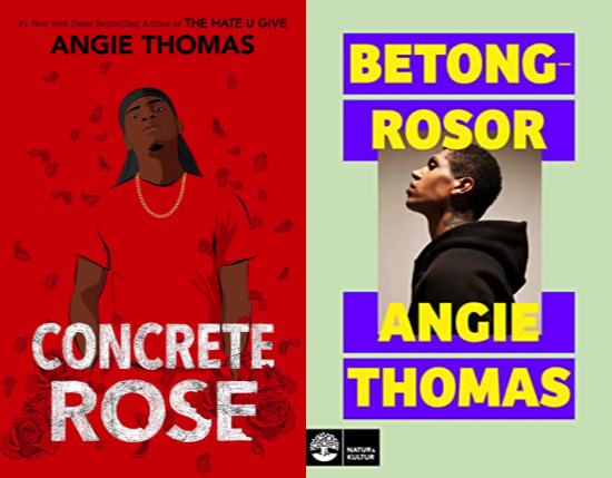
While we’re looking at primarily red US covers, how about Angie Thomas’s Concrete Rose? The illustrated cover pairs so perfectly with The Hate U Give while also making it clear this is fully Maverick’s story. His style screams late-90s/early-00s. Jenna Stempel-Lobell designed the cover and Cathy Charles illustrated.
The Swedish book cover on the right is both incredibly different and incredibly similar. It’s certainly not illustrated, but it does center Maverick and though the styling is less indicative of a time period, the timelessness of it makes it clear the story itself isn’t historical or not timely and relevant today. I’m not a huge fan of the odd color combination of the yellow title on purple blocks, but I do dig Maverick’s profile taking center stage.
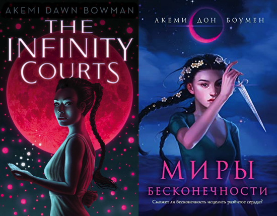
Akemi Dawn Bowman’s sci-fi adventure The Infinity Courts hit shelves last winter with a cover illustrated by Casey Weldon and designed by Laura Eckes. The pitch for this book, which is the first in a series, is Westwood meets Warcross, and I think the US cover does a great job of conveying that. There is a mystery in this one, alongside themes of love, humanity, grief, and technology.
The Russian cover on the right feels a little more fantasy than sci-fi to me, though it, too, is really lovely. The long dark braids of the cover illustration carry over, as does the inclusion of stars and a big pink moon.
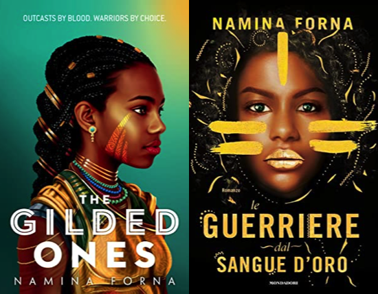
The artwork by Johnny Tarajosu for Namina Forna’s The Gilded Ones is stunning, isn’t it? I love that it portrays its main character as both strong and soft — we see the power in all of the symbology she dons, as much as we see a real softness in her eyes, lips, and expression. The jade green of the cover really makes her skin pop, too. I
The Italian cover on the right reminds me a lot of the updated covers for the Akata Witch series. It doesn’t offer the same softness for our main character as the US cover, but leans more heavily into the strength. The use of only two colors only enhances that feeling of this being a powerful and power-filled book.


إرسال تعليق
0 تعليقات